Crafting the Perfect Hero Section: Insights from Awwwards

In the ever-evolving world of web design, the hero section has become a fundamental component that captures the essence of a website. As highlighted by Awwwards, a prestigious platform that recognizes exceptional web design, the hero section serves as the first impression for visitors. It is a powerful tool that sets the tone, conveys the brand message, and engages users from the moment they land on a page. This article explores the significance of the hero section, key design principles, and how to draw inspiration from Awwwards to create an outstanding hero section.
Understanding the Hero Section

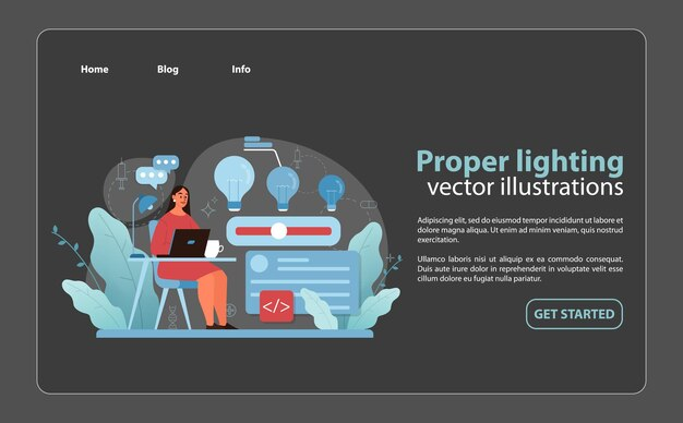
The hero section is the large, prominent area at the top of a webpage, often featuring a striking image or video, a headline, a subheading, and a call-to-action (CTA). It is strategically designed to grab attention and communicate the website’s main purpose or message.
Why the Hero Section Matters
- First Impressions Count: Users typically form an opinion about a website within seconds of landing on it. A well-designed hero section can captivate visitors, making them more likely to explore further.
- Brand Identity: The hero section is an excellent opportunity to showcase a brand’s personality. Whether through color schemes, typography, or imagery, it reflects the values and ethos of the brand.
- Guiding Users: A hero section often includes a clear call-to-action, directing users toward desired actions, whether it’s signing up for a newsletter, exploring a product, or learning more about the brand.
Awwwards and the Art of Design
Awwwards has become synonymous with high-quality web design. It showcases innovative websites that push the boundaries of creativity and functionality. By analyzing award-winning hero sections featured on Awwwards, designers can glean valuable insights into what makes an impactful design.
Key Features of an Effective Hero Section
- Visual Hierarchy: A successful hero section uses visual hierarchy to guide the viewer’s eye. The most important elements, like the headline and CTA, should be the most prominent. Designers can achieve this through size, color contrast, and placement.
- Compelling Imagery: High-quality images or videos can create an emotional connection. A striking visual that aligns with the brand can enhance the overall message and engage users more deeply.
- Concise Messaging: The headline should be short, impactful, and easy to understand. It should communicate the main value proposition clearly and quickly.
- Responsive Design: With the increasing use of mobile devices, ensuring that the hero section looks great on all screen sizes is crucial. A responsive design adapts seamlessly to different devices, providing an optimal user experience.
- Call to Action: The CTA is a critical component of the hero section. It should be clearly defined and encourage users to take immediate action. Phrases like “Get Started,” “Learn More,” or “Shop Now” are effective when they are action-oriented and compelling.
Inspiration from Awwwards: Analyzing Award-Winning Hero Sections
To further understand the impact of an exceptional hero section, let’s analyze some award-winning examples from Awwwards.
Example 1: Bold and Minimalist
One standout design featured on Awwwards utilizes a bold, minimalist approach. The hero section presents a striking monochrome image with a simple yet powerful headline. This design effectively draws the viewer’s attention to the message without overwhelming them with too much information. The CTA button, prominently placed, invites users to learn more about the brand.
Example 2: Engaging Animation
Another impressive example incorporates subtle animations within the hero section. As users scroll, elements of the hero section animate into view, creating an engaging experience. This dynamic approach captures attention and encourages users to interact with the content, enhancing overall user engagement.
Example 3: Full-Screen Video Background
A website with a full-screen video background in its hero section showcases a vibrant and immersive experience. The video tells a story, drawing users in and making them feel connected to the brand. The overlay text remains simple and legible, allowing the visual to take center stage while still delivering the key message.
Best Practices for Designing a Hero Section
To create a hero section that resonates with visitors and aligns with industry standards, consider the following best practices:
1. Define Your Goals
Before diving into design, clarify what you want to achieve with your hero section. Are you looking to promote a new product, highlight a service, or simply raise brand awareness? Defining clear objectives will guide your design choices.
2. Choose the Right Imagery
Select imagery that not only looks great but also aligns with your brand identity and message. High-resolution images or videos that evoke emotion can significantly enhance the impact of your hero section.
3. Utilize Typography Wisely
Typography plays a crucial role in conveying your message. Choose fonts that are readable and align with your brand’s personality. Experiment with font sizes and weights to create a clear visual hierarchy.
4. Optimize for Performance
While aesthetics are important, performance should not be compromised. Optimize images and videos for faster loading times to ensure a smooth user experience. Slow-loading pages can lead to high bounce rates.
5. Test and Iterate
Once your hero section is live, gather data on user interactions. Utilize A/B testing to experiment with different headlines, images, and CTAs. Analyzing user behavior will provide insights for continuous improvement.
Conclusion:
The hero section is a critical aspect of web design that can significantly influence user engagement and conversions. By taking cues from award-winning designs showcased on Awwwards, designers can create impactful hero sections that leave lasting impressions.
More Read